FreshFridge: A Design Journey
Project Background
Many students are concerned about the environment and want to change their behavior to be sustainable, but don’t know how to fit these habits into their everyday lives.
Goal
To help students improve one aspect of their current life habits, in this case reducing food waste, so that they can be more sustainable.
Outcome
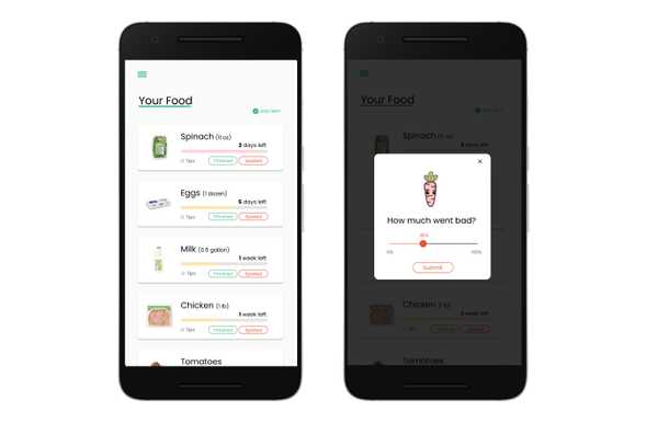
We designed an app that helps students track their food waste, and monitor the freshness of their purchased food. By providing more transparency and insights on their food usage, we’re hoping to motivate students to spend and consume more sustainably.
Design Process
IDENTIFYING THE PROBLEM SPACE
After our team selected the problem, we conducted four (4) contextual interviews to learn more about problem domain. We focused on learning about their: Consumer practices, sustainability goals, views on the environment, and perceived barriers to being more sustainable.
AFFINITY DIAGRAM
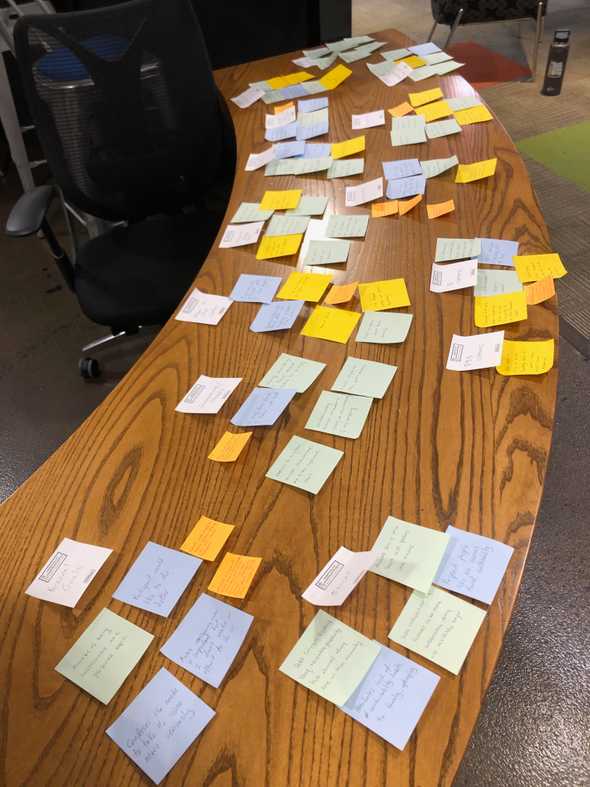
After the contextual interviews, we synthesized our field notes to create an affinity diagram where we were able to identify common threads among the users and gather insights.
We arrived at the following insights: (1) The participants focused on plastics when thinking about reducing their use of non eco-friendly materials; (2) had personal boundaries where they are unwilling to be more sustainable; (3) were willing to reduce their food waste; (4) were motivated to act more sustainably can come in many forms, often personal, and sometimes from their surroundings.
PAPER PROTOTYPE (LOW-FI PROTOTYPE)
We tested the paper prototype on 3 participants whose feedback led to new insights, and ultimately changes.
- Changed the screen name from ‘My Pantry’ to ‘My Foods’ for clarity.
- Changed the labelling of the “Used” button to “Finished” on the ‘My Foods’ page.
- Decided to remove “Used” and Still good” labels for foods on the history page since they caused confusion for the users.
BALSAMIQ PROTOTYPE (MID-FI)
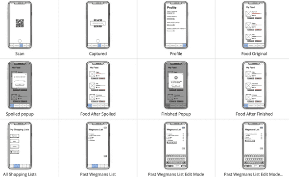
The next step was to do a low-fidelity prototype using Balsamiq where we conducted a heuristic evaluation to identify 25 unique design problems.
The issues included: Having a ‘Save’ button in shopping lists where the user had not made a change; the ‘Add new item’ button on the shopping lists leads to a dead end that tells the user they may be buying too much food; the call to action button after the user selects how much of an item they wasted used the word ‘Enter’ instead of ‘Submit’ which is ambiguous.
FIGMA (HIGH-FI PROTOTYPE)
Finally, we created a high-fidelity Figma prototype that implemented solutions developed previously. With this prototype, we conducted usability tests with 4 participants and extracted UX Problem Instances (UPIs). From these UPIs, we identified several UX Design Problems (UDPs), prioritized and implemented solutions to the UDPs, and completed a finalized design.
You may click here to see the Figma prototype.


